About me 👀️✨️
Taiwan Gospel
Thesis projects
- VR| Bai-Bye
- AR| Kenmen Hype!
- Graphic| Tai-roglyphics
- Graphic| Majolica Tile
- Motion| Beauty of Mudane
- Writing| Thesis Book
- Graphic| Reincarnation
- AR| Blessing Charm
Personal
Cool Fun Stuff!
- VR| Female Planet
- 360 video| Islands Hopping
- Branding| Dream TV
- Book| Courier Specimen
- Poster| 99 Practices
- Book| Anatomy Book Design
- Poster| Future Practice
- Graphic| Desert Flower
- Installation| Action Painting
Business
Animation, Branding, New Media
Animation, Branding, New Media
- Motion| Tito’s Handmade Vodka
- Animation| Funchitecture
- Motion| 100 Years After
- New Media| 1Encounter 1Chance
- Branding| GUMI Factory
- Branding| Mountain Black
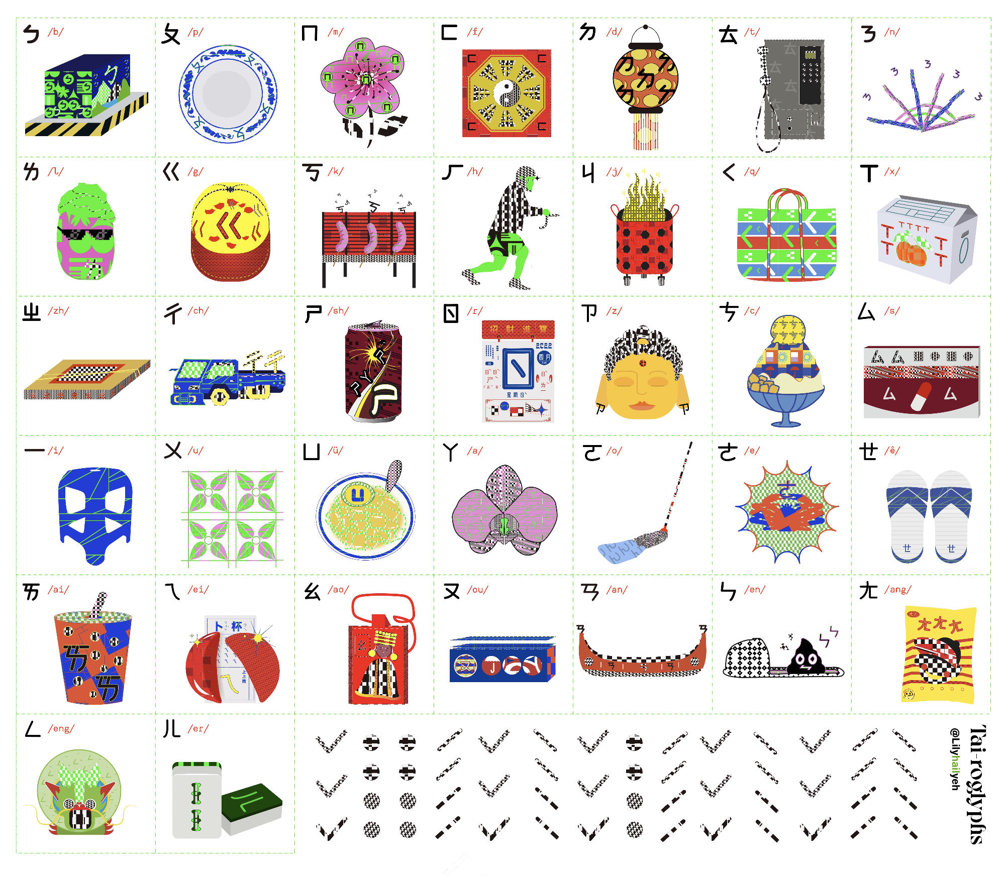
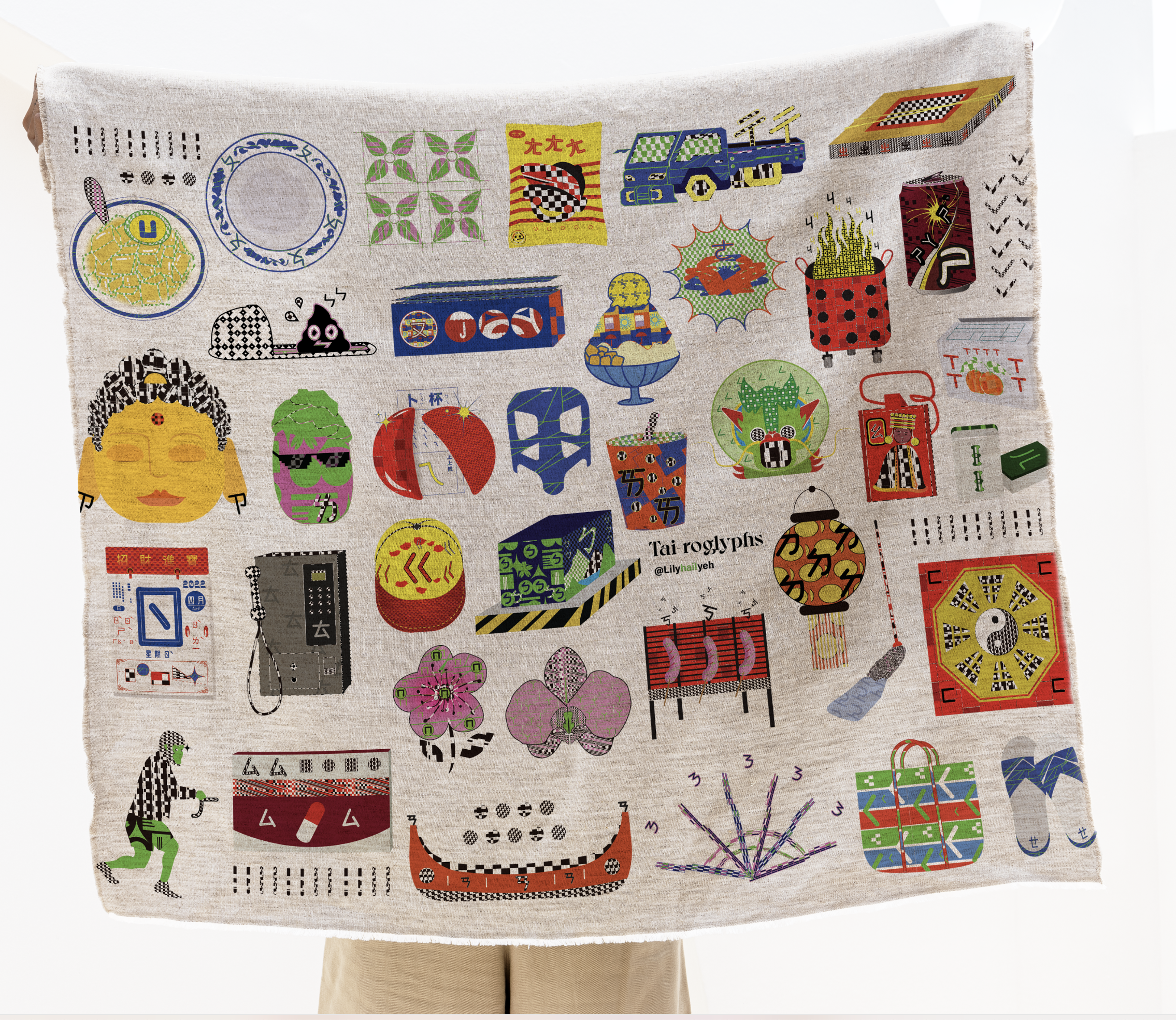
Tai-roglyphics
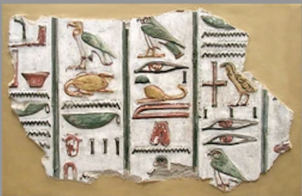
I developed a visual communication tool called Tai-roglyphics to re-design a typeface based on Taiwanese vernacular graphics. Due to historical context, many Chinese traditions only remain practiced in Taiwan. Not only do we retain the traditional Chinese characters to write and read, but we also preserve the Chinese phonetic alphabet (Zhuyin) to help us learn the pronunciation of Chinese characters. There is an internet phenomenon where the Taiwanese use our Zhuyin alphabet to leave political messages online to avoid cyberbullying. This work reflects the crisis of self-censorship we are facing. After interviewing Shan Wu, theTaiwanese Calarts alumni who did an identity-related project, we all share the concern and fear of drawing attention from Chinese internet monitoring that discovers us as Taiwanese independence supporters. Anyone that makes any media in the Chinese language has to walk on eggshells around the topic of Taiwan. This project introduces a "tool” in the form of an encryption system. This typeface gives artists, designers, and anyone with primary education in Taiwan a mechanism to combat Chinese censorship. Exploring Taiwanese visual identity and local design vernacular is also an opportunity to revitalize modern design projects that draw from our heritage.
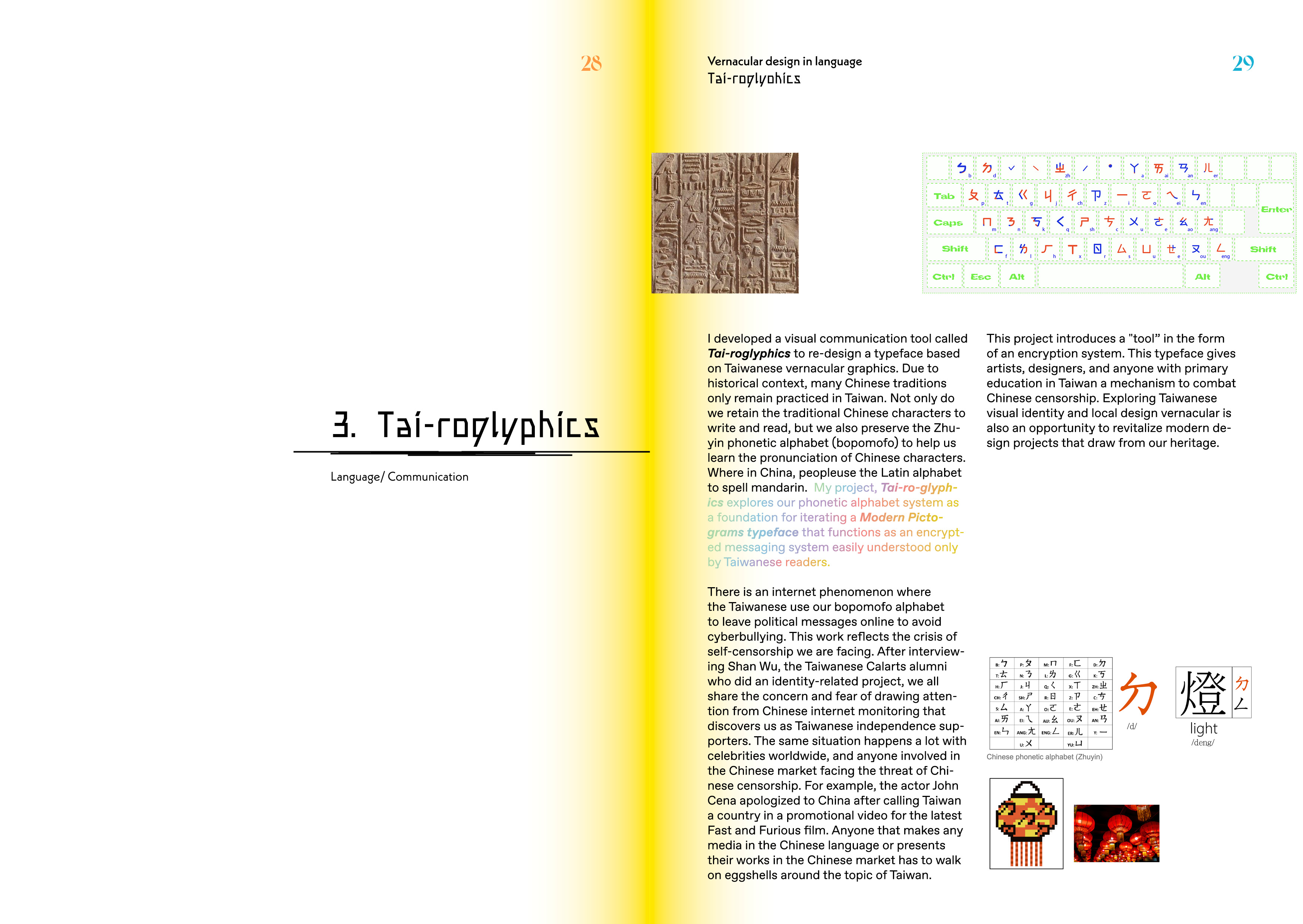
Hieroglyph
In kindergarten, we learned it also from the graphic that pronunciation is related to the character.
 Chinese phonetic alphabet (Zhuyin)

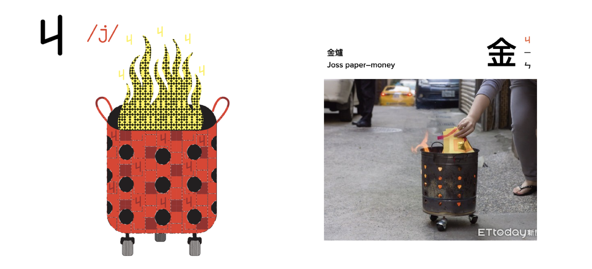
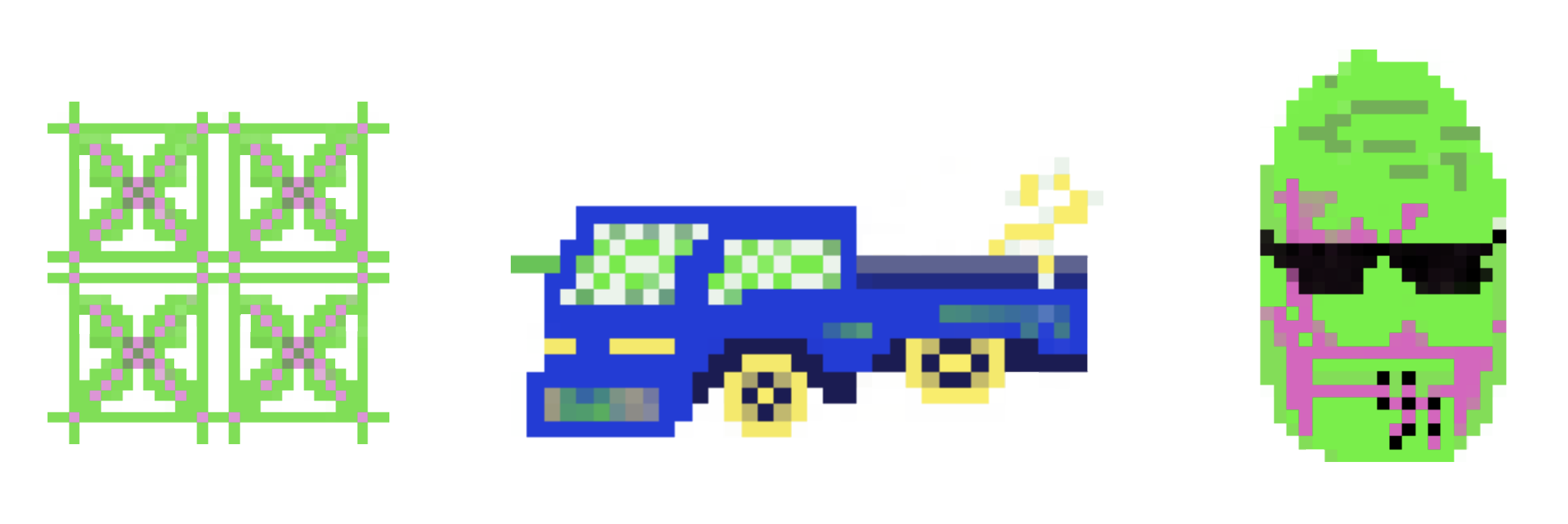
I want to design this alphabet in a pure visualization way. All the graphics to form this typeface are foraged from the everyday mundane objects that permeate my life. Each illustration represents a phonetic alphabet character, all related to its pronunciation.

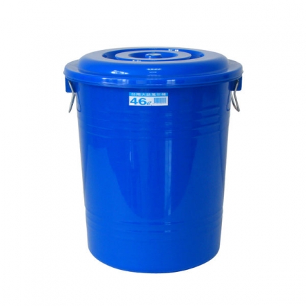
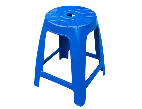
The colors I choose, like the shade of blue, is the same color you can see in the mass-produced plastic products used everywhere in Taiwan
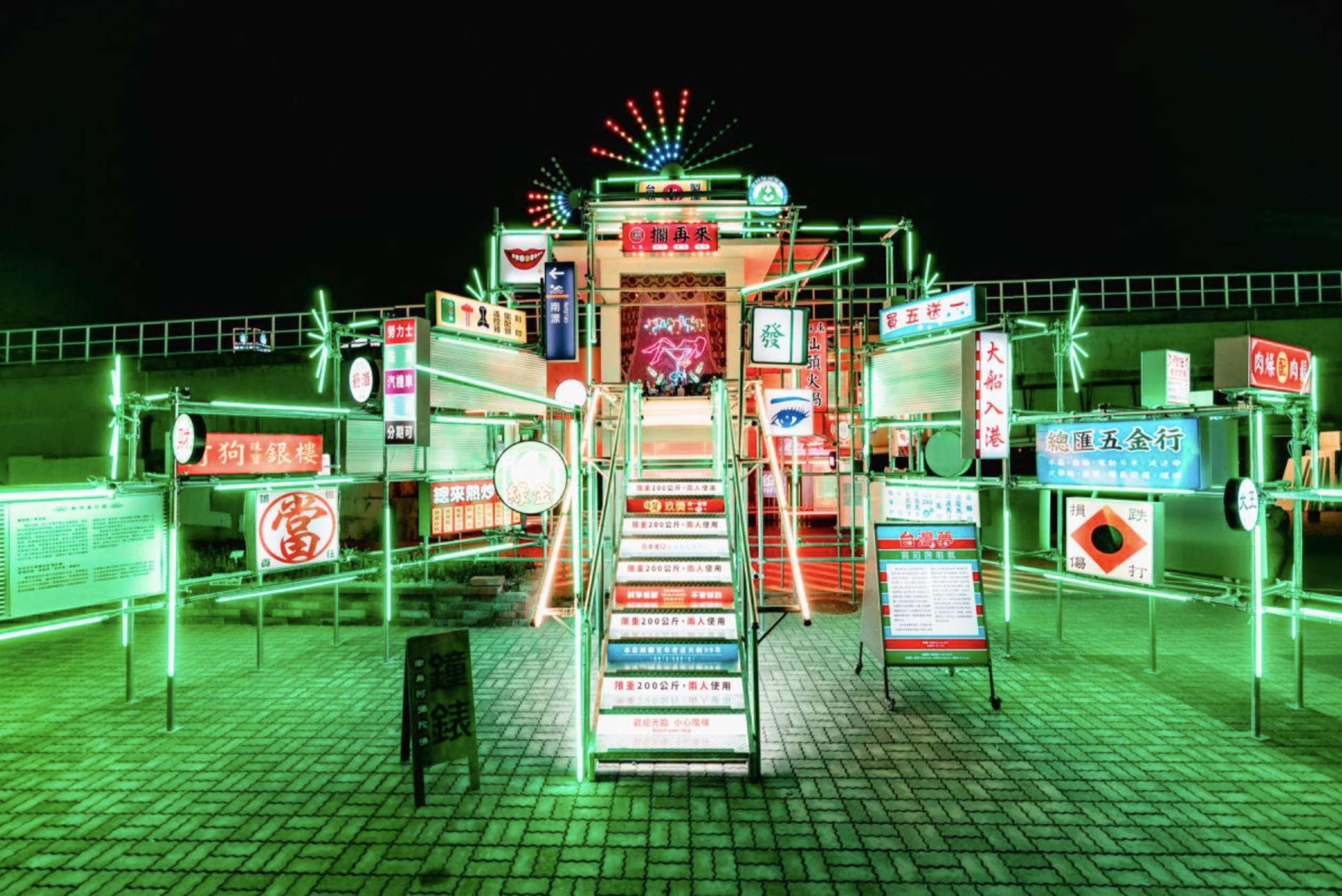
And the neon green is the blush of light in the city where the neon lives. Also, in beetle nut girl culture they present their shop in green, and the peacock neon sign and the beetle nut itself all blend with that same aesthetic.